One-Point Linear Perspective:
Perspective Vocabulary
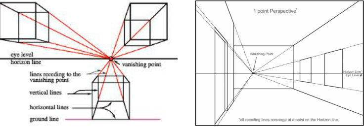
1. Linear Perspective—a system of drawing or painting used to create the illusion of depth on a flat surface. The lines of buildings and other objects in a picture are slanted inward, making them appear to move back, into space. If lengthened, these lines will meet at a point along an imaginary horizontal line representing the eye level. The point at which the lines meet is called a vanishing point.
2. Space—element of art referring to the empty or open area between, around, above, below or within objects. Shapes and forms are defined by the space around and within them.
3. Horizon Line—a level line where water or land seems to end and the sky begins. It is usually on the eye level of the observer. If the horizon cannot be seen, its placement must be imagined.
4. Vanishing Point—in a perspective drawing, one or more points on the horizon where parallel lines that go back in space seem to meet. The placement of the vanishing point depends upon the viewer or artist.
5. Converging Lines—lines that seem to point toward a central place in space, such as a vanishing point. In perspective drawings, converging lines are actually parallel. The illusion created by distance and space makes the parallel lines seem to converge.
6. Horizontal—a line or shape that is parallel to the top and bottom edges of a surface. Horizontal lines run left to right.
7. Vertical—a line that runs straight up and down from a level surface. Vertical lines are at right angles to the bottom edge of a paper, and parallel to the side of the paper.
8. Perspective—techniques for creating a look of depth on a two-dimensional surface.
9. Eye Level Line—an imaginary line marking the level of a person’s eyes. The horizon line always appears to be at a person’s eye level.
10. Parallel—lines or objects that extend in the same direction and at the same distance apart, so lines, edges or planes will never meet.
Systems of Perspective
1. Overlap--overlap objects so that one object appears to be behind the other.
2. Size--if objects are the same size, those placed in the distance will look smaller than the closer ones.
3. Placement--objects higher in a picture appear to be in the distance.
4. Detail--sharp edges and more detail suggest nearness, dulled edges and less detail suggest distance.
5. Color and Value--lighter values and cooler, duller colors suggest distance features.
6. Converging Lines--parallel lines and edges seem to go toward one or more vanishing points.
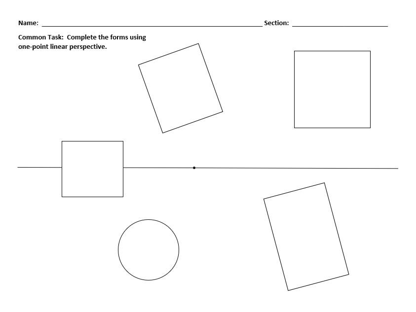
Rules for One-point Linear Perspective
1. Establish an eye-level line and a vanishing point.
2. Draw a shape that is parallel to you.
3. Draw lines that converge to the vanishing point from the corners of the shape, except where they pass through the original shape.
4. Close the form with lines parallel to the original shape.
5. Erase unnecessary lines.
1. Linear Perspective—a system of drawing or painting used to create the illusion of depth on a flat surface. The lines of buildings and other objects in a picture are slanted inward, making them appear to move back, into space. If lengthened, these lines will meet at a point along an imaginary horizontal line representing the eye level. The point at which the lines meet is called a vanishing point.
2. Space—element of art referring to the empty or open area between, around, above, below or within objects. Shapes and forms are defined by the space around and within them.
3. Horizon Line—a level line where water or land seems to end and the sky begins. It is usually on the eye level of the observer. If the horizon cannot be seen, its placement must be imagined.
4. Vanishing Point—in a perspective drawing, one or more points on the horizon where parallel lines that go back in space seem to meet. The placement of the vanishing point depends upon the viewer or artist.
5. Converging Lines—lines that seem to point toward a central place in space, such as a vanishing point. In perspective drawings, converging lines are actually parallel. The illusion created by distance and space makes the parallel lines seem to converge.
6. Horizontal—a line or shape that is parallel to the top and bottom edges of a surface. Horizontal lines run left to right.
7. Vertical—a line that runs straight up and down from a level surface. Vertical lines are at right angles to the bottom edge of a paper, and parallel to the side of the paper.
8. Perspective—techniques for creating a look of depth on a two-dimensional surface.
9. Eye Level Line—an imaginary line marking the level of a person’s eyes. The horizon line always appears to be at a person’s eye level.
10. Parallel—lines or objects that extend in the same direction and at the same distance apart, so lines, edges or planes will never meet.
Systems of Perspective
1. Overlap--overlap objects so that one object appears to be behind the other.
2. Size--if objects are the same size, those placed in the distance will look smaller than the closer ones.
3. Placement--objects higher in a picture appear to be in the distance.
4. Detail--sharp edges and more detail suggest nearness, dulled edges and less detail suggest distance.
5. Color and Value--lighter values and cooler, duller colors suggest distance features.
6. Converging Lines--parallel lines and edges seem to go toward one or more vanishing points.
Rules for One-point Linear Perspective
1. Establish an eye-level line and a vanishing point.
2. Draw a shape that is parallel to you.
3. Draw lines that converge to the vanishing point from the corners of the shape, except where they pass through the original shape.
4. Close the form with lines parallel to the original shape.
5. Erase unnecessary lines.
The Color Wheel:
Color Vocabulary
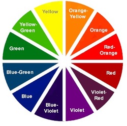
1. Spectral colors—the arrangement of colors red, orange, yellow, green, blue and violet.
2. Hue—the name of a spectral color (can be interchanged with the word color).
3. Primary hues—colors that can’t be made by mixing. Red, blue and yellow are primary.
4. Secondary hues—colors that are made by mixing two primaries together. Red and yellow make orange. Blue and yellow make green. Red and blue make violet.
5. Intermediate hues—colors that are made by mixing a primary color and its adjacent secondary color. Red and orange make red-orange. Yellow and orange make yellow-orange. Yellow and green make yellow-green. Blue and green make blue-green. Blue and violet make blue-violet. Red and violet make red-violet.
6. Color wheel—a tool for organizing color, or a spectrum bent into a circle.
7. Color scheme—a plan for organizing color.
8. Value—refers to the lightness or darkness of a color.
9. Tint—refers to a light value of a color, or a color plus white.
10. Shade—refers to a dark value of a color, or a color plus black.
11. Monochromatic colors—one color and the tints and shades of that color, or a color plus white and black.
12. Complementary colors—colors that are opposite one another on the color wheel. Red and green, blue and orange, or yellow and violet are complements.
13. Intensity—the brightness or dullness of a color. You can change a color’s intensity by adding its complement to dull it.
14. Analogous colors—colors that sit side by side on the color wheel. For example, blue, blue-green, green and yellow-green are analogous.
15. Warm colors—colors that are associated with heat, warmth, the sun, etc. Red, orange and yellow are warm colors.
16. Cool colors—colors that are associated with cold, snow, grass, etc. Blue, green and violet are cool colors.
17. Neutral colors—a color not associated with a hue, such as black, white, gray and brown.
Creating an Abstract Still-life:
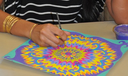
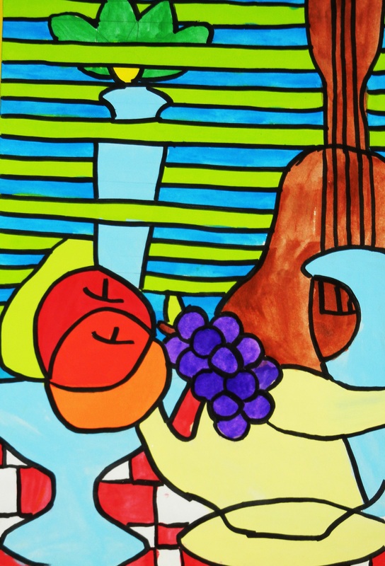
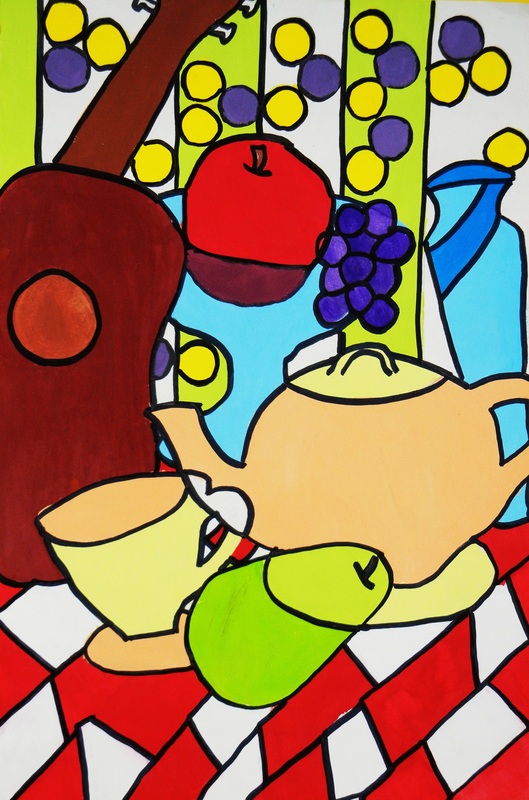
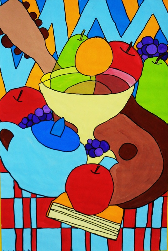
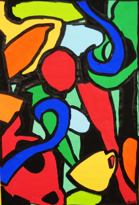
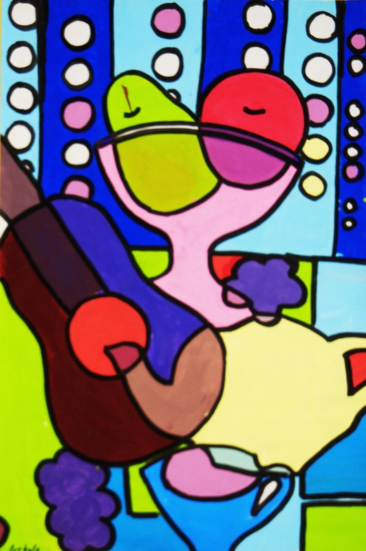
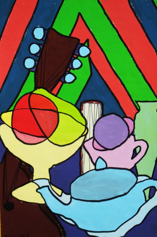
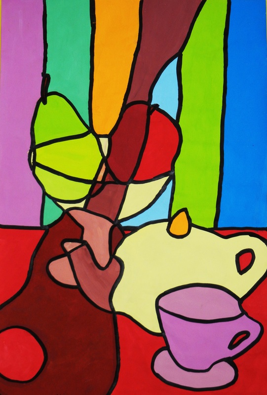
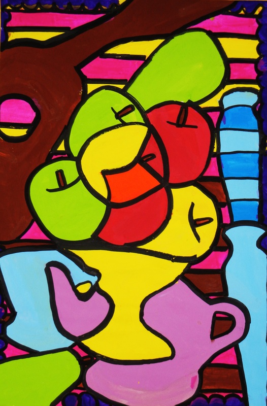
Students learned how artists create still-life abstractions by employing overlap, transparency, simplification, repetition, and omission of details.
Students designed an abstract still-life composition using pre-cut templates to create overlap, transparency, simplification, repetition, and omission of details.
Students painted their abstract still-life using local color, appropriate color mixing and brush control techniques, and proper tempera paint application.

Click on a picture to view as a slide show!
Drawing with Value:
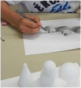
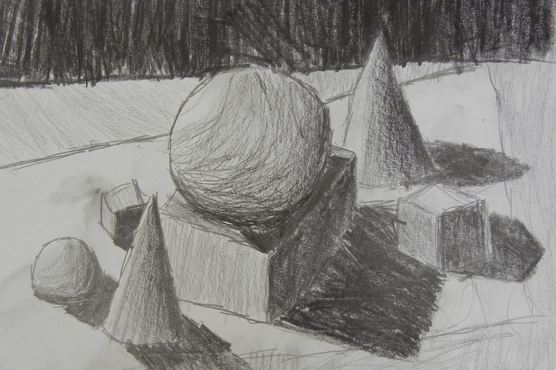
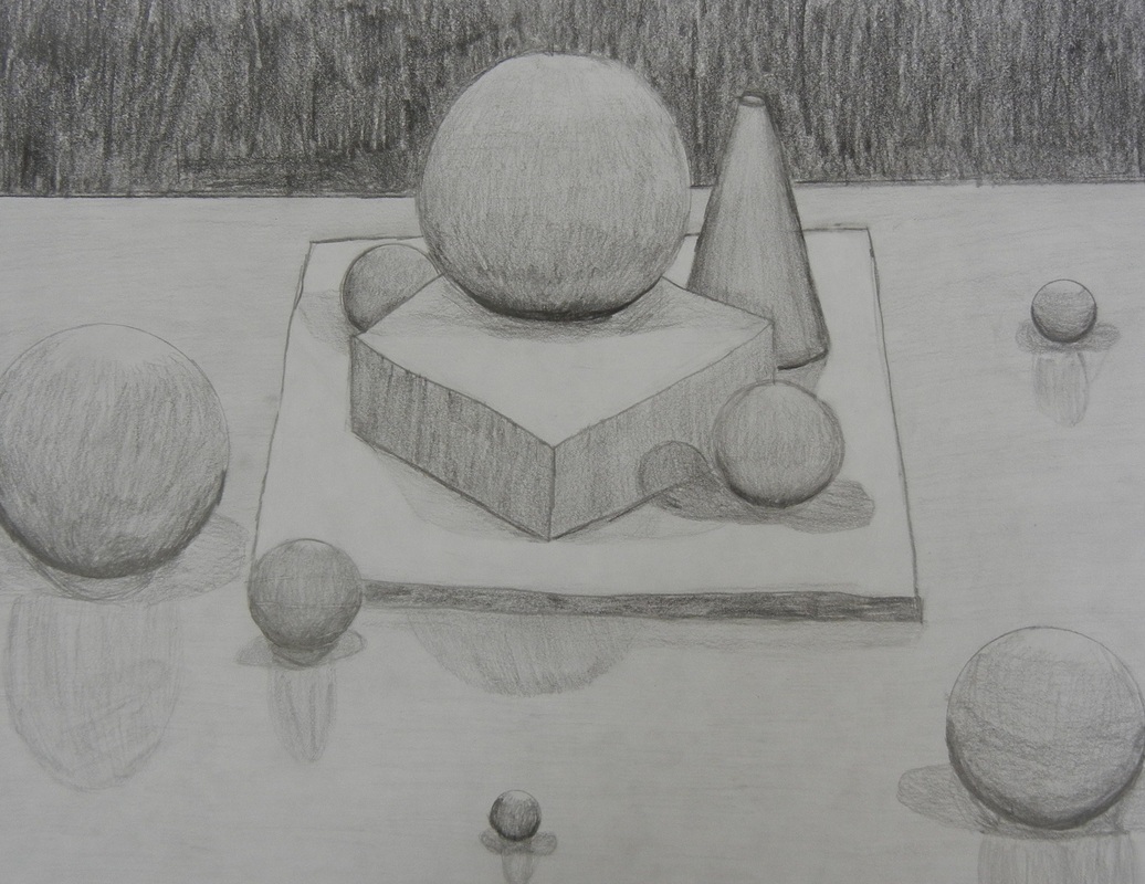
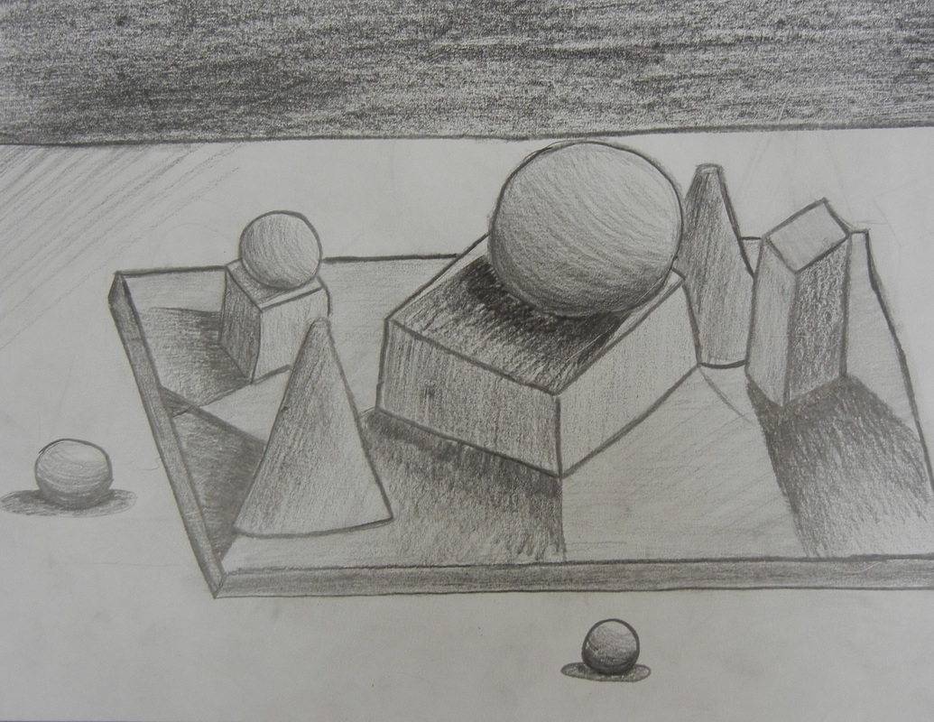
Students learned that value is the word artists use to describe light and dark areas in a work of art, and that value is an element of art.
Students learned that artists utilize shading to demonstrate the arrangement of light and shadow upon the objects they are drawing.
Students learned about the effects of a light source upon the value of still-life objects.
Students created a still-life composition based upon geometric figures, then shaded their drawings to create the illusion of form, indicating the correct source of light.


Working with Clay:
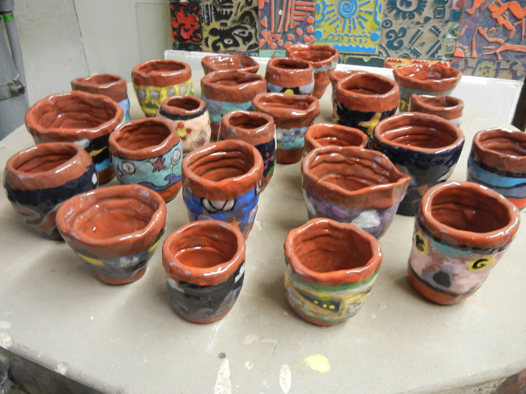
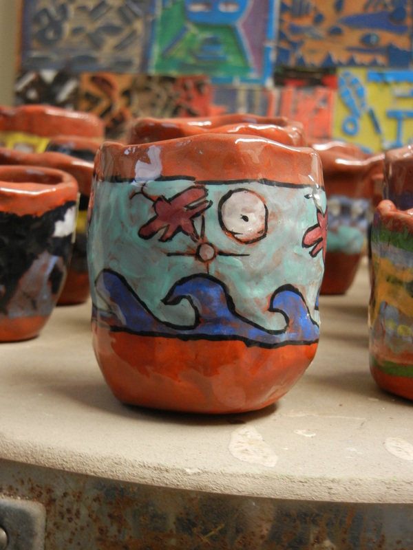
Students learned about traditional Pueblo pottery methods and the importance of maintaining cultural practices, such as making pottery and teaching pottery making skills to others.
Students created a pottery piece of uniform thickness and stable construction, using hand building techniques (pinch and coil) inspired by traditional Pueblo pottery.
Students painted their pottery pieces with underglaze and glaze, creating a band design inspired by traditional Pueblo symbols.
Students created a pottery piece of uniform thickness and stable construction, using hand building techniques (pinch and coil) inspired by traditional Pueblo pottery.
Students painted their pottery pieces with underglaze and glaze, creating a band design inspired by traditional Pueblo symbols.